Google switched to mobile-first indexing in 2021. Now, the mobile version of your site is what Google uses to rank your pages. This affects every website, from small businesses to large companies.
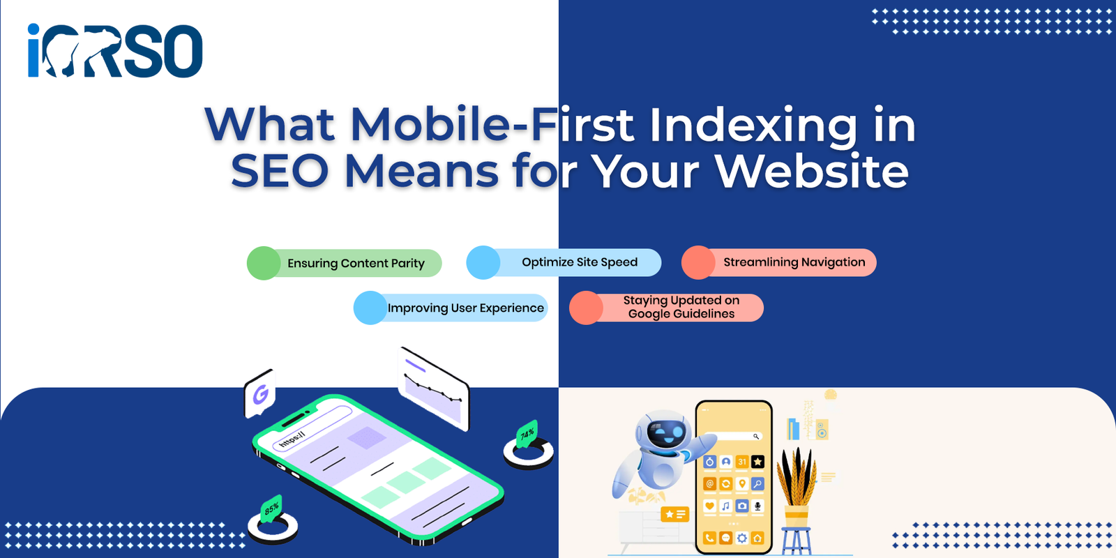
What Is Mobile-First Indexing?
Google’s bots now crawl your mobile site first. They use it to decide how to rank your content. Your desktop site still gets crawled, but mobile comes first.
Here’s the simple version:
- Before 2021: Google looked at your desktop site first
- After 2021: Google looks at your mobile site first
How This Affects Your Rankings
Your mobile site quality now controls your rankings on ALL devices. A bad mobile site means lower rankings everywhere, even for people searching on desktop.
What Google Looks At
- Speed: Mobile pages must load in under 3 seconds
- Same content: Your mobile site needs the same content as desktop
- Easy to use: Buttons must be easy to tap. Text must be easy to read
- Technical setup: Meta tags and structured data must work on mobile
Common Problems
Many sites lose rankings because their mobile version is missing key pieces:
- Content hidden inside mobile accordions
- Internal links removed from mobile menus
- Images that load too slowly on phones
- Broken structured data on mobile pages
How to Optimize for Mobile-First Indexing
1. Check Your Mobile Content
Open your site on a phone. Compare it to the desktop version. Look for:
- Missing text or images
- Hidden content behind tabs or accordions
- Menus that drop important links
- Videos that don’t play on mobile
2. Speed Up Your Mobile Site
Focus on these three metrics:
- LCP (Largest Contentful Paint): Under 2.5 seconds
- FID (First Input Delay): Under 100 milliseconds
- CLS (Cumulative Layout Shift): Under 0.1
3. Use Responsive Design
- Use flexible grid layouts that adapt to screen size
- Add srcset to images so phones load smaller files
- Make tap targets at least 44 pixels wide
- Test on at least 3 different screen sizes
4. Keep All SEO Elements on Mobile
Your mobile site needs everything your desktop site has:
- Title tags and meta descriptions
- Proper heading order (H1, H2, H3)
- Alt text on every image
- Schema markup and structured data
- XML sitemap access
How to Test Your Mobile Site
Google’s Free Tools
Use Google’s Mobile-Friendly Test for a quick check. It spots basic problems in seconds. Then run PageSpeed Insights for deeper speed data. Focus on the mobile score, not desktop.
Search Console Reports
Check Google Search Console every week. It flags mobile problems like:
- Text that’s too small to read
- Buttons too close together
- Content wider than the screen
- Missing viewport settings
Track Your Results
Watch these numbers each month:
- Mobile traffic: Should grow month over month
- Bounce rate: Keep it under 60% on mobile
- Time on page: Mobile should match desktop levels
- Core Web Vitals: All three scores should be green
Mistakes to Avoid
Hiding Content on Mobile
Never hide text on mobile that shows on desktop. Google sees this as missing content. It will hurt your rankings for those topics.
Slow Mobile Loading
53% of mobile visitors leave if a page takes over 3 seconds. Compress your images. Cut unused code. Use a CDN for faster delivery.
Removing Mobile Links
Simple mobile menus often cut important links. This hurts Google’s ability to crawl your site. Keep all key pages in your mobile navigation.
Frequently Asked Questions
Does mobile-first indexing mean Google ignores desktop?
No. Google still crawls your desktop site. But it uses the mobile version as the main source for ranking decisions.
Will a bad mobile site hurt my desktop rankings?
Yes. Google uses mobile signals for all search results. Poor mobile quality drags down rankings on every device.
Do I need a separate mobile website?
No. Use responsive design instead. One site that works on all screens is easier to manage and better for SEO.
How fast will I see results?
Most sites see changes within 2-4 weeks. Full results take 3-6 months of steady work.
What’s the biggest mobile SEO mistake?
Hiding content on mobile that exists on desktop. Google treats this as missing content and lowers your rankings.
Should I care more about mobile speed or desktop speed?
Mobile speed matters more for SEO. But both should be fast for the best user experience.
How do I check if Google uses mobile-first indexing for my site?
Open Google Search Console. Use the URL Inspection tool. It shows which version Google crawls for each page.
Mobile-first indexing is here to stay. Your mobile site is now your main site in Google’s eyes. Fix your speed, match your content, and test on real devices. The payoff is better rankings on every screen. Learn more about SEO and AEO services.