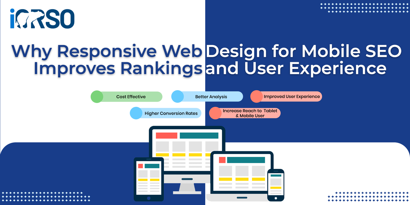
In the age of mobile-first indexing, responsive web design for mobile SEO is no longer optional, it’s essential. With more than half of global internet traffic coming from mobile devices, Google has adapted its ranking systems to prioritize mobile-friendly websites. But this shift isn’t just about search engine optimization; it’s about delivering a user experience on every screen, every time.
A responsive website doesn’t just look good, it performs well across all devices, loads quickly, and adapts intuitively to the needs of modern users. In this guide, we’ll break down what responsive design really means, why it matters for SEO and usability, and how to implement it effectively on your website.
What Is Responsive Web Design for Mobile SEO?
Responsive web design for mobile SEO refers to designing and developing a website in a way that ensures content, layout, and elements automatically adjust based on the screen size and device type a visitor is using. Whether someone views your site on a smartphone, tablet, or desktop, a responsive website offers an optimized, consistent experience without requiring different versions of the site.
Responsive design uses flexible grids, CSS media queries, and dynamic resizing to Create an interface that adapts to each user’s screen. It’s all about flexibility and accessibility, two things that search engines and users alike value highly.
Why Google Prioritizes Responsive Web Design for Mobile SEO
- Mobile-First Indexing Is the New Standard
Since 2019, Google has been rolling out mobile-first indexing, which means it primarily uses the mobile version of a site’s content for indexing and ranking. If Your Website Isn’t optimized for mobile, it will likely struggle to rank, even if the desktop version is flawless.
- Improved Crawl Efficiency
With responsive design, Google only needs to crawl one version of your website, which improves crawl efficiency and reduces duplicate content issues. It simplifies your SEO management by consolidating URLs and avoiding canonical conflicts between mobile and desktop versions.
- Faster Load Times on Mobile
Responsive websites are designed to minimize load times, especially on mobile devices where connection speeds may be slower. Google takes page speed seriously, especially for mobile users, and responsive design plays a key role in delivering faster, leaner pages.
How Responsive Web Design for Mobile SEO Improves User Experience
A key aspect of SEO success is how users interact with your site. Search engines monitor metrics like bounce rates, time on site, and pages per session, all of which are influenced by user experience. Here’s how responsive web design for mobile SEO enhances UX:
- Navigation
Responsive websites provide clear, easy-to-use navigation menus that adapt to touch gestures. Whether someone is scrolling with a thumb or clicking with a mouse, navigation should feel intuitive.
- Content That’s Easy to Read
Small fonts, crowded layouts, and hard-to-click buttons frustrate mobile users. Responsive Design addresses these issues by adjusting fonts, spacing, and interactive elements to ensure text is legible and touch targets are finger-friendly.
- Visual Consistency
A responsive site maintains branding consistency across all devices. This not only builds trust but also provides a smooth experience as users move between devices, which is especially important in industries like e-commerce, SaaS, or services where the decision-making process may span multiple visits.
- Fewer Redirects and Errors
Separate mobile sites (like m.example.com) often rely on redirects that can fail or confuse users. With a single responsive site, you reduce technical errors, 404s, and broken links, all of which improve both usability and search visibility.
Core Principles of Responsive Web Design for Mobile SEO
Creating a fully responsive site means applying a set of design and development best practices. Here are the fundamentals:
- Fluid Grids
Instead of fixed-width layouts, use percentages and relative units (like em or rem) to define element widths. This ensures that columns, images, and text blocks resize fluidly as the viewport changes.
- Flexible Media
Images, videos, and other media should scale with the screen size. This can be done using max-width: 100% in CSS to ensure assets don’t overflow their containers.
- Media Queries
Use CSS media queries to apply different styles at different screen widths. You can target breakpoints like 768px or 1024px to optimize your layout for smartphones, tablets, and desktops.
- Mobile-First Design
Build your website starting with mobile users in mind, then progressively enhance it for larger screens. This method ensures that the mobile experience is fast and streamlined.
How Responsive Web Design for Mobile SEO Affects Your Rankings
Let’s take a closer look at the SEO-specific benefits that come with responsive design:
- Lower Bounce Rates
If users land on your site and quickly leave due to poor mobile experience, Google will take notice. Responsive design reduces bounce rates by ensuring content is accessible and engaging on every screen.
- Higher Dwell Time
When users can easily read, navigate, and interact with your site on mobile, they’re more likely to stay longer, explore more pages, and engage with your content. That’s good for SEO.
- Improved Backlink Value
Sites with responsive design are more likely to receive natural backlinks, especially from mobile-first publishers. Since responsive URLs don’t change across devices, all backlinks point to a single source, maximizing SEO equity.
- Increased Social Sharing
Users are more likely to share mobile-friendly content from their phones. Responsive design helps ensure that your pages display well when shared on social media platforms, improving your visibility and traffic.
Best Practices for Implementing Responsive Web Design for Mobile SEO
If you’re building or revamping your website, use these tips to align design and SEO from the start:
- Use Google’s Mobile-Friendly Test to identify responsiveness issues
- Avoid intrusive interstitials (like full-screen popups) that frustrate mobile users
- Compress images and minify CSS/JavaScript to reduce page load time
- Ensure clickable elements are well-spaced so users don’t accidentally tap the wrong link
- Keep forms short and simple for mobile interactions
- Use structured data and schema markup to enhance visibility in search results
Tools to Test and Optimize Responsive Web Design for Mobile SEO
Here are some tools that can help you test and improve your mobile SEO and responsive design performance:
- Google Search Console – Monitor mobile usability issues and indexing performance
- Google Lighthouse – Get a full performance audit including mobile metrics
- BrowserStack or Responsinator – Test how your site appears across different devices and screen sizes
- GTmetrix or PageSpeed Insights – Analyze loading times and core web vitals for mobile
- Hotjar or Microsoft Clarity – Track how real users interact with your responsive layout
future trends: Why Responsive Web Design for Mobile SEO Is More Important Than Ever
As mobile technology advances and user expectations increase, responsive design will continue to evolve. Trends to watch include:
- AI-powered personalization that adapts layout and content in real-time
- Voice-enabled interfaces requiring responsive visual complements
- Progressive Web Apps (PWAs) that combine responsive design with app-like performance
- Dynamic rendering and adaptive content that adjust to user context and intent
The takeaway? Investing in responsive web design for mobile SEO is not just a technical task, it’s a strategic move to stay competitive in a mobile-first world.
Make Mobile SEO Work Harder for You with Responsive Design
In the battle for attention, ranking, and revenue, responsive design plays a pivotal role. It’s more than just resizing elements, it’s about creating a site that’s fast, accessible, and enjoyable to use for everyone, on every screen.
Whether you’re optimizing an existing site or building one from the ground up, focusing on responsive web design for mobile SEO will help you improve rankings, increase traffic, and build stronger connections with your audience.
Let iORSO help you design a responsive, mobile-first website that delivers both SEO results and a user experience.
Contact us today to learn how we can build or optimize your site to work better, look sharper, and rank higher, across every screen.
Learn more about google’s latest algorithm.