If your ads, emails, or social media campaigns are getting clicks, but your visitors aren’t taking action, your landing page could be the problem. Traffic is only half the battle. What happens after the click is where conversions are won or lost.
That’s why learning how to create high-converting landing pages is one of the most valuable skills any marketer, business owner, or designer can master. The good news? You don’t need a full design team or massive budget to do it, you just need the right strategy.
In this guide, we’ll break down what makes a landing page convert, the essential elements to include, and actionable steps to create one that turns browsers into buyers.
What Is a Landing Page?
A landing page is a standalone web page created specifically for a marketing or advertising campaign. It’s where visitors “land” after clicking a link in an ad, email, or search result, and it’s designed with one clear goal: conversion.
That conversion could be:
- Buying a product
- Signing up for a free trial
- Downloading a lead magnet
- Booking a consultation
- Registering for a webinar
Unlike your homepage or blog, landing pages are focused and distraction-free, guiding visitors to take a single action.
Why Landing Pages Matter for Conversion Rate
Your conversion rate is the percentage of visitors who take your desired action. A well-optimized landing page can improve that number dramatically, without increasing your traffic or budget.
Why they work:
- Targeted messaging for a specific audience
- Limited navigation (no menu, no distractions)
- Clear call-to-action (CTA)
- Aligned with the ad or link that brought the user there
- Designed to reduce friction and build trust
If you’re not using dedicated landing pages, you’re likely missing out on conversions.
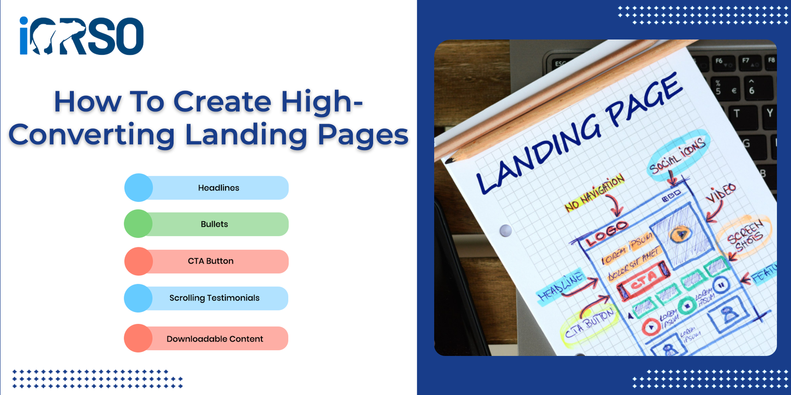
How to Create High-Converting Landing Pages: Step-by-Step
Here’s how to Build a landing page that doesn’t just look good, it performs.
- Start with One Goal, One Audience
Every landing page should focus on one audience segment and one desired action.
Ask yourself:
- Who is this page for?
- What do I want them to do?
- What stage of the customer journey are they in?
Clarity beats cleverness. Trying to appeal to everyone usually results in converting no one.
- Craft a Compelling Headline
Your headline is the first thing visitors will see, and you have just a few seconds to grab their attention.
Tips for great headlines:
- Be clear, not clever
- Highlight a benefit or result
- Reinforce the offer or value
- Use powerful words that evoke curiosity or urgency
Examples:
- “Double Your Email List in 30 Days, Without Paid Ads”
- “Get Your Free Marketing Plan in Under 60 Seconds”
- “Stop Guessing. Start Ranking. Free SEO Audit Today”
The headline should align with the ad or source that brought the visitor there.
- Write Benefit-Driven Copy
Visitors don’t care about your product or service, they care about what it can do for them. Make sure every line of copy focuses on benefits over features.
Do this:
- Highlight pain points and how you solve them
- Use simple, conversational language
- Break text into short paragraphs or bullet points
- Include Social Proof (testimonials, logos, reviews)
Avoid:
- Industry jargon
- Long walls of text
- Talking only about yourself
- Design for Clarity, Not Complexity
A clean, minimal layout often performs better than a flashy one. Your landing page should make it impossible to get confused.
Design must-haves:
- Plenty of white space
- Bold, clear headlines and CTAs
- Mobile-responsive design
- Fast loading time (under 3 seconds)
- High-contrast CTA buttons
Avoid clutter, excessive animations, or too many colors. Simplicity sells.
- Use One Primary Call-to-Action (CTA)
Your CTA is the action you want the user to take. It should be visible, specific, and repeated at least twice on the page (above the fold and at the end).
CTA tips:
- Use action verbs: “Get,” “Start,” “Download,” “Claim”
- Match the offer: “Get My Free Ebook,” “Start My Free Trial”
- Use contrasting colors for CTA buttons
- Avoid vague CTAs like “Submit” or “Click Here”
The entire page should be built around getting the user to click that button.
- Add Visual Proof and Trust Signals
People are skeptical. They want to know they’re not wasting time or money. That’s where trust signals come in.
Elements that build trust:
- Customer testimonials (with names and photos)
- Client logos or partner badges
- Media mentions
- Case studies or before/after results
- Security badges (for checkout pages)
Social proof reduces friction and makes people feel safe to take action.
- Keep Forms Short and Sweet
If your landing page includes a form, only ask for what you truly need. Fewer fields = higher conversions.
Recommended fields:
- Name (optional)
- Email address
- Maybe one custom field (e.g., “Company size” or “Industry”)
If you’re offering something of high value (Like a Proposal or quote), longer forms can work, but always test to see what converts best for your audience.
- Optimize for Mobile First
More than 60% of landing page traffic comes from mobile devices. If your page isn’t optimized for small screens, you’re leaking conversions.
Mobile tips:
- Large tap targets
- Fast load speed
- Compressed images
- Stacked content, not side-by-side
- Prioritize scrollable content with early CTAs
Always test your page on multiple devices before launching.
- A/B Test Everything
The only way to know what works best is to test. Use A/B testing to experiment with:
- Headlines
- CTA text and button color
- Images or video
- Form length
- Layout variations
Use tools like Unbounce, Instapage, or Google Optimize to run simple tests and improve your page based on data, not guesswork.
- Track and Improve
Launch is just the beginning. Review analytics regularly to understand what’s working and what’s not.
Key metrics to track:
- Conversion rate
- Bounce rate
- Average time on page
- Traffic sources
- Scroll depth
Tools like Google Analytics, Hotjar (for heatmaps), and Meta Pixel can help you collect and act on real user behavior.
Examples of High-Converting Landing Pages
Here are some formats that consistently perform well:
- Lead magnet landing page – Offer a free ebook, checklist, or template
- Free trial sign-up page – Highlight benefits and testimonials
- Product launch page – Combine storytelling with scarcity
- Event registration page – Use urgency and A Simple RSVP form
- Booking/consultation page – Feature availability calendar and service overview
Each of these follows the same core principles: one goal, clear messaging, and strong CTA.
Final Thoughts: Great Landing Pages Don’t Happen by Accident
You don’t need to be a designer or copywriter to Build a page that converts. You just need a clear offer, strong messaging, and a distraction-free layout that guides your visitors toward one action.
Mastering how to create high-converting landing pages is one of the most powerful marketing skills you can develop, especially if you’re investing in ads, Email Marketing, or organic traffic.
Want help Building a landing page that converts visitors into customers?
Contact us today and let iORSO build, design, and optimize your next high-converting campaign page, done-for-you and results-driven.