Introduction
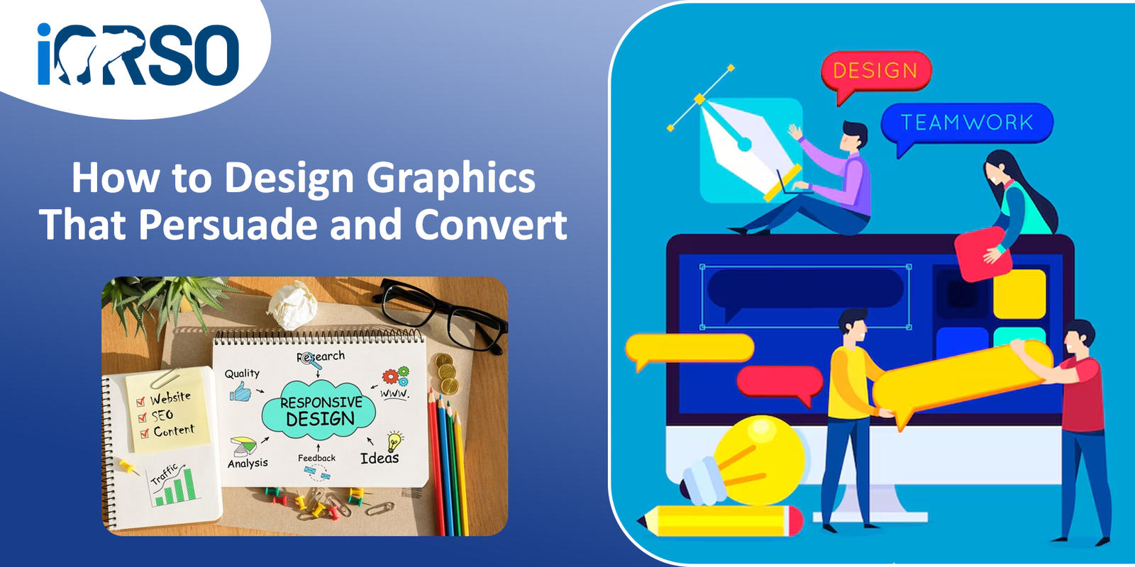
Great graphic design is more than just making things look good, it’s about persuasion and conversion. Whether you’re creating a landing page, an advertisement, or a social media post, your visuals play a critical role in grabbing attention, building trust, and driving action.
But how do you design graphics that don’t just look appealing but actually convince people to engage, subscribe, or buy? The key lies in understanding human psychology, using strategic design principles, and optimizing for conversions.
This guide will break down how to create persuasive, high-converting graphics that get results.
- The Psychology Behind Persuasive Design
Effective graphic design isn’t just about aesthetics, it’s about influencing behavior and decision-making.
Key Psychological Principles in Design
- Visual Hierarchy – Guides the viewer’s eye to the most important elements first.
- Color Psychology – Evokes emotions and affects decision-making.
- Contrast & Readability – Ensures key messages stand out.
- Cognitive Fluency – Makes content easy to process and understand.
- Social Proof & Trust Signals – Builds credibility and reassures customers.
Example: A red “Buy Now” button creates urgency, while a blue “Learn More” button feels more informational and trustworthy.
- Choosing the Right Colors for Conversion
Colors trigger emotions and influence decisions. That’s why color psychology is essential for persuasive design.
Best Colors for Persuasion and Action
- Red – Urgency, excitement, passion (best for call-to-action buttons).
- Blue – Trust, reliability, professionalism (common in finance and tech).
- Green – Growth, harmony, health (ideal for eco-friendly brands).
- Yellow – Optimism, attention-grabbing (often used for urgency or warnings).
- Black – Luxury, sophistication, power (used by premium brands).
Pro Tip: Use contrast to make CTAs stand out. A bright orange or green button on a white background attracts more clicks than a subtle, neutral color.
- Using Typography to Guide Attention
Typography can shape perceptions, improve readability, and influence decision-making.
best practices for Persuasive Typography
- Use clear, readable fonts – Avoid overly decorative fonts for important messages.
- Emphasize key words with bold or larger font sizes.
- Stick to two or three complementary fonts – Too many fonts create confusion.
- Align text for easy scanning – Most people skim rather than read word-for-word.
Example: A headline that says “Limited-Time Offer: Get 50% Off Today” in bold, large text grabs attention more effectively than a generic phrase in small, unformatted text.
- The Power of Images in Persuasive Design
People process images 60,000 times faster than text. The right image can tell a story, evoke emotions, and drive conversions.
How to Use Images for Maximum Impact
- Show happy, satisfied customers using your product.
- Use real people over stock photos for authenticity.
- Highlight product benefits visually (before-and-after graphics, infographics).
- Use directional cues (arrows, people looking toward the CTA button) to guide attention.
Example: A landing page for a weight-loss product with a before-and-after transformation image is far more convincing than just listing product features.
- Creating High-Converting Call-to-Action (CTA) Graphics
Your CTA button is where conversions happen, so it needs to be clear, compelling, and visually distinct.
How to Design a Persuasive CTA
- Use action-driven language – “Get Started,” “Claim Your Free Trial,” “Shop Now.”
- Make it pop with color contrast – A CTA should stand out from the rest of the page.
- Add urgency – “Limited Offer” or “Only a Few Left” can boost conversions.
- Position it strategically – Place CTAs above the fold and at natural stopping points.
Example: Domino’s using a big, bold red button with “Order Now – 30% Off Today” will convert more visitors than a plain “Learn More” link.
- Using White Space for Better Readability and Focus
White space (negative space) makes designs more readable and draws attention to key elements.
How to Use White Space Effectively
- Avoid clutter – Give elements room to breathe.
- Use spacing to group related information together.
- Highlight important elements – A CTA surrounded by white space stands out more.
Example: Apple’s product pages use plenty of white space to keep the focus on their sleek product images and clear CTAs.
- The Role of Trust Signals in Graphics
Trust is a major factor in conversions. Visual elements that build credibility make people more likely to take action.
Trust-Building Graphic Elements
- Customer Reviews & Testimonials – Show real feedback from happy customers.
- Security Badges – Display SSL certificates, payment security icons, and trust badges.
- Logos of Recognized Clients or Partners – Boosts credibility.
- Certifications & Awards – Show industry recognition to build trust.
Example: An e-commerce checkout page featuring “100% Secure Payment” and “Money-Back Guarantee” badges reassures customers and reduces cart abandonment.
- Mobile Optimization: Designing for Conversions on Any Device
With over 60% of web traffic coming from mobile devices, your graphics must be mobile-friendly.
Best Practices for Mobile-Optimized Design
- Use scalable images and responsive layouts.
- Ensure text is legible on small screens.
- Place CTAs where they are easily tappable.
- Test loading speed – Slow pages hurt conversions.
Example: A mobile-optimized landing page should have a large, easy-to-tap CTA button, minimal distractions, and clear messaging above the fold.
- A/B Testing Your Graphics for Higher Conversions
Even the best-designed graphics can be improved. A/B testing helps identify what works best.
What to A/B Test in Graphic Design
- Different CTA button colors and placements.
- Image-based designs vs. illustration-based designs.
- Minimalist layouts vs. text-heavy layouts.
- Different font styles, sizes, and contrast levels.
Example: Testing a blue CTA button vs. a red CTA button might reveal that red gets 20% more clicks, helping you optimize for conversions.
- Measuring Graphic Design Success: Key Metrics to Track
To ensure your graphics are persuasive and converting, track the right metrics.
Important Design Performance Metrics
- Click-Through Rate (CTR) – Measures how many people interact with CTAs.
- Conversion Rate – Shows how effective your design is at driving sales.
- Bounce Rate – High bounce rates may indicate poor design or lack of clarity.
- Time on Page – Longer time on page suggests engaging visuals.
Example: If a landing page’s CTA button change results in a 30% higher conversion rate, you know the new design is more persuasive.
Final Thoughts: Design with Conversion in Mind
Great design isn’t just about looking good, it’s about guiding visitors toward action. By applying psychology-driven design principles, using effective CTAs, optimizing visuals for trust, and continually testing improvements, you can create graphics that don’t just attract attention but convert visitors into customers.
Need High-Impact Graphic design that Converts?
At iORSO, we specialize in conversion-focused graphic design that helps businesses increase engagement, build trust, and drive more sales. Whether you need ad creatives, website graphics, or Social Media visuals, we’ve got you covered.
Let’s create designs that persuade and convert. Contact us today.