Design That Sells
Your Website Isn’t just a digital brochure, and the psychology of web design proves it, it’s a psychological experience. Every color, layout, and font choice affects how visitors feel about your brand and whether they trust you enough to take action.
In 2025, web design isn’t only about aesthetics, it’s about behavioral design. Small businesses that understand the Psychology Behind their website design can turn more visitors into customers without spending more on ads.
The Connection Between Design and Conversion
Research indicates that users form an impression of a website in under 0.05 seconds, and 94% of that impression is based on design.
Good design builds trust and credibility. Poor design drives people away, even if your product or service is excellent.
At iORSO, our Web Design Services focus on combining beautiful design with proven conversion psychology.
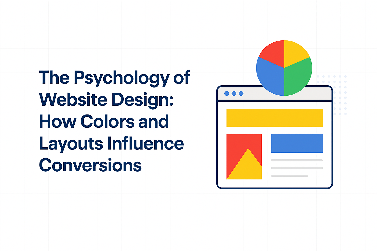
Colors evoke emotion and influence action. The right palette can encourage trust, urgency, or excitement, depending on your goals.
Common Color Associations
- Blue: Trust, reliability (ideal for finance, tech, and professional services).
- Green: Growth, wellness, calm (great for health, sustainability, and eco brands).
- Red: Energy, urgency (use sparingly for CTAs or limited-time offers).
- Orange/Yellow: Optimism, creativity (effective for friendly, approachable brands).
Pro Tip: Choose colors that reflect your brand personality and use contrast strategically to make your CTAs stand out.
- Layout and Visual Hierarchy
Your website’s structure determines what visitors notice first and how easily they navigate.
- Place your primary CTA (“Get a Quote,” “Book a Call”) above the fold.
- Use consistent font sizes and whitespace for clarity.
- Apply the F-pattern or Z-pattern layout for natural eye movement.
Our On-Page SEO Services ensure your design isn’t just beautiful, it’s optimized for readability, engagement, and conversions.
- Simplicity Builds Trust
Complex layouts overwhelm users. Clean, minimalistic design helps them focus on what matters, your message and your CTA.
Example: Apple’s website uses simplicity and whitespace to make its products shine. Your small business can apply the same principle, even on a smaller scale.
- Visual Cues That Drive Action
Use arrows, images, and shapes that guide the user’s eye toward the desired action.
For instance, a photo of a person looking toward your “Get Started” button can subtly direct user attention there.
- Consistency Builds Recognition
Keep your fonts, colors, and tone consistent across every page. This reinforces brand identity and makes your business more memorable.
When users in Atlanta visit your site and immediately recognize your brand style, they’re more likely to engage, trust, and convert. See how our Atlanta web design team applies these principles for local businesses.
The Science Behind Trust and Conversions
Psychology-based design isn’t manipulation, it’s communication. It helps users find what they’re looking for, feel confident in their choice, and take action without hesitation.
- Trust = Familiarity + Functionality + Visual Clarity
- Conversion = Emotion + Logic + Ease of Use
When you design with these principles, you’re not just creating pages, you’re shaping decisions.
How iORSO Combines Design and Psychology
At iORSO, we design websites that look great and convert. Our approach includes:
- Web Design Services → Mobile-friendly, conversion-optimized websites.
- On-Page SEO Services → Structuring content and layouts for maximum impact.
- Local support from our Atlanta marketing team → Experts in user behavior and local audience preferences.
Design Isn’t Decoration. It’s Strategy
Your website’s design should tell a story, guide the visitor, and drive conversions. When colors, layout, and content work together, your site becomes more than a digital space, it becomes your best salesperson.
Ready to redesign your website for better conversions? Contact iORSO Today.
Read more about design your. Read more about media.
The psychology of website design is the study of how visual elements like colors, layouts, typography, and spacing influence user behavior and conversion rates on websites. Every font choice, button color, and layout decision triggers a psychological response in visitors. Businesses that understand these principles build websites that guide users toward action. This knowledge separates high-converting websites from those that lose visitors in seconds.
Color Psychology for Websites
Colors trigger emotional responses that directly affect buying decisions. The table below shows how different colors influence website visitors and which industries use them most effectively.
| Color | Emotion | Best For | Example Brands |
|---|---|---|---|
| Blue | Trust, security, calm | Finance, healthcare, tech | PayPal, Facebook, IBM |
| Red | Urgency, excitement, passion | Food, sales, entertainment | Netflix, YouTube, Coca-Cola |
| Green | Growth, health, nature | Wellness, finance, eco brands | Whole Foods, Shopify, Spotify |
| Orange | Energy, confidence, action | CTAs, e-commerce, SaaS | Amazon, HubSpot, Etsy |
| Black | Luxury, sophistication, power | Fashion, premium services | Chanel, Nike, Apple |
| Yellow | Optimism, warmth, attention | Children’s brands, food, retail | McDonald’s, IKEA, Snapchat |
| Purple | Creativity, wisdom, premium | Beauty, education, spiritual | Cadbury, Hallmark, Twitch |
Frequently Asked Questions About Website Design Psychology
How does color affect website conversions?
Color directly affects website conversions by triggering emotional responses that influence buying decisions. Studies show that changing a CTA button color can increase click-through rates by up to 21%. Red and orange buttons create urgency, while blue builds trust for higher-value purchases.
What is the best website layout for conversions?
The best website layout for conversions uses the F-pattern or Z-pattern that matches natural eye movement. Place your most important content and CTAs along these visual paths. Single-column layouts with clear visual hierarchy consistently outperform cluttered multi-column designs for lead generation.
How does typography influence user trust?
Typography influences user trust by signaling professionalism and brand personality within milliseconds. Serif fonts like Georgia convey authority and tradition, while sans-serif fonts like Open Sans feel modern and approachable. Poor font choices or hard-to-read text cause 38% of visitors to leave a website immediately.
What is visual hierarchy in web design?
Visual hierarchy is the arrangement of design elements in order of importance to guide users through content. Designers create hierarchy using size, color, contrast, spacing, and positioning. A strong visual hierarchy ensures visitors see your headline first, then supporting content, then the call to action.
How can small businesses improve website conversion rates?
Small businesses can improve website conversion rates by simplifying their homepage, using one clear CTA per page, and choosing colors that match their brand personality. Speed matters too: pages that load in under 3 seconds convert 2x better than slower pages. Start with your highest-traffic page and test one change at a time for measurable results.